1 Introduction
The default page of the V-BOX web SCADA platform after login is shown as below. The main functions of this platform include the centralized monitoring, template management, project management, and authority management. The user could switch between the function modules through the left navigation bar, and the specific content of each function module will be displayed on the right side.

Introduction
- Centralized monitoring: project list, that is displayed in groups;
- Template management: add and edit templates;
- Authority management: assign a project with configuration authority for view-account
2 Log in
Click Cloud SCADA under service in the upper right corner, or enter http://web.v-box.net/ on browser.

The account of the V-box web SCADA platform is the same as the V-BOX account.

3 Centralized monitoring
Centralized monitoring is the default home page of the platform. As shown as the figure below.
This page displays projects under each group by switching groups. You could add, delete and modify the group. In addition, you ccoul add or remove projects from groups, browse projects, and configure project parameters.
Group management
The centralized monitoring module classifies the project by group.

- Switch group: Click group name to switch group.
- Add a group: Click
 to add a new group.
 - Edit group: Click
 to edit the group name.
 - Delete group: Click
 to delete the current group.
 - More group: Click
 to display the previous or next group.
New project
Click "New project" on the upper right corner to create a new project. You could input the project name, select a group and whether it is cross-box.

Click "Thumbnail" to upload a thumbnai. It will be displayed as the preview image of the project.

Manage project
The centralized monitoring module includes the following functions: add new projects, delete projects and preview projects for each group. Click on the corresponding group to display the list of projects in the group, as shown below.
Manage project: Click "manage project" to assign a project in the group.
Delete project: Click  on the upper right corner of a project thumbnail in the project list to move the project out of the group.
Preview project: Click on  to view the configuration screen of the project.
Display mode: You could switch the display mode by clicking the icons on the upper right corner of page, shown as below.

Browse project
Click on in the project list to view the configuration screen.

Real-time data: Click the "Real-time Data" to view the device name and state, current value, encoding, description, etc.
Alarm data: Click the "Alarm data" button to pop up the alarm record page and view the current alarm status and historical alarm information.
Historical data: Click the "History Data" button to pop up the history report interface of the data. You could view all the historical data.
Multi-language: multi-language drop-down menu, one object could support three language at the same time, you could switch language by this menu.
 Open or close the alarm sound of the alarm record object.
 Full screen display or restore configuration screen.
 Hide or show the top blue menu bar.
 Zoom in the screen.
 Zoom out the screen.
Project setting

 Configuration design: Click the button to enter the configuration programmer to design the configuration screen for that project. Please refer to 5 V-box WEB SCADA design for details.
 Preview project: Click the project preview image or click the button to browse the configuration screen of the project.
 Login-free browse: Click the button and set the expiration time in the pop-up box to generate the browsing address and QR code (scan to browse, but not to operate).
 Copy project: Click the button to set the name and group of the new project to add a new project.
 Export project: Click the button to export the project.
 Edit project: Click the button to modify the project (project name and whether or not to cross V-BOX option), upload and delete thumbnails.
 Delete project: Click the button to delete the project.
 Assigned to a group: Click the button to assign the project to a group.
4 Template
Template management
Click the template management module on the left menu to enter the template management module.

The V-box Web SCADA platform provides a template management module that could save the designed configuration screen as a template and user could import the template to design the project more efficiently.
 Add template: Click the button to add a template as below.

 Edit template: Click the button to edit the name and resolution of the template.
 Delete template: Click the button to delete the template.
Template design
Click the "Template Design" in the template list to access the V-box configuration platform editor page. You could edit the template in this page. More details about how to design the project please refer to 5 V-box WEB SCADA design.
5 Web SCADA design
Main screen
Click "Design" (or Template design) in "Project Management" (or Template Management) screen to access WEB SCADA editor.

The function partition of WEB SCADA editor.

- Toolbar: A function bar that provides pages operations and objects operations;
- Project Manager: It shows all screens for project and operations.
- Objects Library: It provides 8 basic shapes objects and 20 common objects for creating SCADA page;
- Design Area: Design area for SCADA page and template;
Design process
- Create new screen and set the property;
- Select the object and drag the mouse in design area;
- Edit object property and set the variable etc;
- Save the screen;
Screen management
A project or template is composed of one or several screens. A template contains only one screen, whereas a project can be composed of one or more screens (only take project as an example.). All screens are listed on "Project Manager". Select screen name, its page would be displayed on "Design Area".
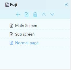
The screens are divided into normal screens and sub-screens, as shown above.
- The normal screen will be displayed when viewing a project or template.
- Sub-screen is embedded in the pop-up box of the normal screen, and the function switch and other objects are used to click the popup display.
In the project browsing page, the default display is the top common screen in the screen list, i.e., the main screen in the figure above, and the other screens will be switched through screen jumping or linking, etc.
Create screens
Click  to create a new screen. Set the porperties in the pop-up box, select the screen type (normal screen and sub-screen) and save.

Modifying screen
- Select the page to be modified;
- Click
 on "Project Manager" or
  on "Toolbar";
 - Modify screen on [Design Area];
- Click
 on "Toolbar" to complete modification;
Deleting screen
- Select screen on "Project Manager";
- Click
 , and following message would pop up to prevent accidental deletion;

- Click "OK" to delete page.
Sort screen
- Select page screen on "Project Manager";
- Click
 to sort screen upwards or downwards.
Object
The Web SCADA platform provides a variety of visualizations for users to design screen. All objects listed on "Object Library“.
The screen is made up of objects.All the objects are provided in the object bar, and control points will appear around all the objects selected in the canvas.
Only the special attributes of the objects are listed for explanation, and the basic attributes of the objects, such as position, style, lock, etc., are not listed.
Adding object
- Select and click the object on ”Objects Library“;
- Move the cursor to the "Design Area";
- When cursor changes as + symbol, hold down left click draw the desired size;
The initial object is bound to V-BOX by default, and its monitoring point information list also displays V-BOX by default. After device switching, the device type of the last binding will be remembered. When the monitoring point information of the object is opened next time, it will be displayed according to the current type, and operations such as copying the object will also give the newly copied object the same binding type as the original object.
Current object: If you click a object, it will be in the selected state, that is, the current part. Control points with red background and black edge will appear around the current obejct.
Selected object: Click the blank space of the canvas, left-click the mouse to select an area, or hold down the Ctrl key and click the desired part. Objects with red or white dots around them are collectively referred to as selected parts.
Moving object
- Select object on "Design Area";
- Hold down the left click and move object to desired position.

Scaling object
- Select object, the positioning control point would appear around object;
- Click any control point;
- Move point to scale object.
Editing object
Select device type
Double-click the object to open property window, and click the button  to select the device to be bound. One object can only bind one device type.

If you choose V-BOX, the HMI of the current account will be filtered out in the multi-level grouping of the device selection drop-down box, and only the V-BOX bound to the current account will be displayed.
If you choose to bind an ig HMI, only the HMI bound by the current account will be displayed.
Object state modification
Double-click the object to open property window, modify the parameters, and save.

Object device modifcation
- Common object: you have bound the monitoring point information belonging to the V-BOX at the monitoring monitoring point of the object. If you modify the monitoring point, there will be a reminder to confirm the switching device binding type. (If "Clear Original Configuration" is selected, then all the monitoring point information of the box bound to the object will be cleared, and switch the binding type of the object from V-BOX to HMI.
- Time object: Because HMI can't report the time, the monitoring equipment function of the time object can't be compatible with HMI. Therefore, when selecting the monitoring point of the monitoring device, there is only the option of V-BOX, and its multi-level grouping will only display the information of V-BOX. The display and hide function of this object can still bind HMI, but if the display and hide monitoring points are bound, the monitoring point binding to the monitoring device will be cleared.
- Alarm record object: Because the operation of binding monitoring point is different from other objects, no matter what the binding type before the object is, when switching between V-BOX and HMI, a switching reminder will be given. At the same time, when switching the binding device type at "display/conditional hide", the monitoring point information of the object binding will also be cleared, and the device type display will be switched.
- Report object: When you switch the device type of report binding at the monitoring point binding of the report, a switching reminder will be given. At the same time, if you switch the binding device type at "display/conditional hide", the monitoring point information of the component binding will also be cleared, and the device type display here will be switched.
- Map object: You open the map and all the devices are selected by default. You could set according to your needs. At the same time, if you switch the binding device type in "display/conditional hide", the configuration will be cleared, and all devices will be displayed on the map by default.
Object shape

Line: A line segment with a starting position and an ending position, which can be hidden by setting styles and conditions.
Rectangle: Used to display rectangular objects, and you can set its position, size, style, conditional hide, etc.
Circle: Used to display circular objects, and you can set its position, size, style, conditional hide, etc.
Ellipse: Used to display oval objects, and you can set its position, size, style, conditional hide, etc.
Triangle: Used to display triangle objects, and you can set its position, size, style, conditional hide, etc.
Text: Used to display text content parts, and you can set text style and background style, and support multi-language input.
| Property | Description |
|---|---|
| Multilingual | 3 languages input and setting are supported, and each language can set the style and display mode of text separately. You need to select the language before setting the text content. The content of the text will be displayed according to the language selected when browsing the interface. |
| Rounded corner | Sets the rounded corners of appearance rectangle of the text object . |
| Fill color | Sets the fill color of appearance rectangle of the text object. |
| Border color | Sets the border color of the text object. |
| Line type | Sets the line type of the text object. |
Thickness | Sets the thickness of the border of the text object. If you choose to hide the border, the border will not be displayed. |
| Conditional hide | Set monitoring points and triggering conditions when hiding the object. (conditions for bit address and word address configuration are different) |
Picture: It is used for displaying the picture, and supports the user defined picture.
| Property | Description |
|---|---|
| Gallery | Choose the picture from the gallery |
| Angle | Rotation angle (0~360) |
| Conditional hide | Set monitoring points and triggering conditions when hiding the object. (conditions for bit address and word address configuration are different) |
Table: Custom table object. You could form the table quickly.
| Attribute | Description |
|---|---|
| Background color | Sets the background color of the table object. |
| Background transparency | Set the transparency of the background color in the table object (where the transparency is 0%, the background is full transparent). |
| Number of rows | Sets the number of rows for the table object. (Limit the number of rows accordign to the object size) |
| Number of columns | Sets the number of columns in the table part.(Limit the number of columns accordign to the object size) |
| Border color | Sets the color of the border of the table part. |
| Frame thickness | Sets the thickness of the table part border. |
| Row and column adaptation | According to the component size, set the average distribution of width and height of the table. |
| Hide line dividers | If checked, the line showing the row is hidden. |
| Hide column divider | If checked, the line showing the column is hidden. |
2)Common

- Display Frame
| Item | Description |
| Monitoring Point | Set operating address for this object (Read and write can be different); |
| Read-write permission | There are three modes for it, users could select according to requirements; |
| Set Text | It is used for setting style of text and display direction |
| Style | It is used for setting object display, like background color; |
| Expansion | It is used for setting expansion function, like lock position; |
| Display | It is used for setting object position and size |
- Bit /Word Indicator
Indicator could monitor and display the specified PLC or HMI bit address, and its state changes according to the specified address value.
| Items | Description |
| Monitor Point | Set reading address for this object; |
| Status | Set text for every status; |
| Picture | Set picture for every status; |
| Expansion | Set display expansion function, such as blink |
| Display | Set object position and size |
- Bit/ Word Switch
Switch could operate the specified PLC or HMI bit address, and its state changes according to the specified address value.
| Items | Description |
| Monitor Point | Set operating address for this object (Read and write can be different); |
| Read-write permission | There are three modes for it, users could select according to requirements; |
| Pop up a confirmation box | Check it to enable confirmation box for operating; |
| Status | Set text for every status; |
| Picture | Set picture for every status; |
| Expansion | Set display expansion function, such as blink |
| Display | Set object position and size |
- Dashboard
Display the value of address in real time using the dashboard.
| Items | Description |
| Monitor Point | Set operating address for this object (Read and write can be different); |
| Select | Set dashboard display range, there are two modes, Constant and Variable |
| Scale value | Check it to display value; |
| Select Language | Set text for object; |
| Style | Set object display style such as color, scales number; |
| Alarm Zone | Set range and color for alarm |
| Display | Set object position and size |
- Bar graph
Use the length or height of the rectangle to reflect the value of reading address so that the value could be visualized.
| Items | Description |
| Monitor Point | Set operating address for this object (Read and write can be different); |
| Digit Display | Check it to display digit value on bar; |
| Progress bar direction | Select display direction; |
| Scales | Set object scales display type and color; |
| Bar color | Set color for bar; |
| Background Display | Set color of bar background; |
| Alarm Zone | Set range and color for alarm |
| Display | Set object position and size |
- Real-Time Trend Chart
Use the curve to show the trend of the data over time. X-axis is time, Y-axis is variable.
| Items | Description |
| Monitor Point | Set operating address for this object (Read and write can be different); |
| Digit Display | Check it to display digit value on bar; |
| Progress bar direction | Select display direction; |
| Scales | Set object scales display type and color; |
| Bar color | Set color for bar; |
| Background Display | Set color of bar background; |
| Alarm Zone | Set range and color for alarm |
| Display | Set object position and size |
- Flow pipe
This is a flowing animation object, users could set animation trigger condition for it, the monitor point could be both bit address and word address;
| Items | Description |
| Border color | Set object background color; |
| Color | Set flowing block color; |
| Speed | Three modes for flowing block speed; |
| Flow direction | Two modes for flowing direction; |
| Monitor Point | Set trigger address; |
| Trigger Condition | Bit address: Select ON or OFF; Word address: Set value range; |
| Color Block Width | Set flowing block size; |
| Color Block Length | Set flowing block size; |
| Color Block Spacing | Set the spacing between flow blocks; |
| Display Border | Select display or hide border; |
| Alarm Zone | Set range and color for alarm |
| Display | Set object position and size |
Tips for designing flow bar
When user need to simulate the flow of water in a pipe, please put the pipe picture at first, then hide the flow border and place it onto the pipe picture.
- Video object
Video object is used for playing the video file provided in the video source.
| Items | Description |
| Border color | Set object background color; |
| Color | Set flowing block color; |
| Speed | Three modes for flowing block speed; |
| Flow direction | Two modes for flowing direction; |
| Monitor Point | Set trigger address; |
| Trigger Condition | Bit address: Select ON or OFF; Word address: Set value range; |
| Color Block Width | Set flowing block size; |
| Color Block Length | Set flowing block size; |
| Color Block Spacing | Set the spacing between flow blocks; |
| Display Border | Select display or hide border; |
| Alarm Zone | Set range and color for alarm |
| Display | Set object position and size |
- Hyperlink
The object for link website;
| Items | Description |
|---|---|
| Link address | Enter website; |
| Open with | There are two options, user could select open with new window or current window; |
| Select Language | One object could support three language, user could enter text for note object; |
| Style | Set object display style such as color, use picture as background or not |
| Display | Set object position and size |
- Function Switch
Function switch is designed to switch screens, and call and close sub screen.
| Items | Description |
|---|---|
| Screen | Select the target screen for switch; |
| Sub-screen | There are two options, user could select open with new window or current window; |
| Previous | Switch to the previous screen |
| Next | Switch to the next screen |
| Return | Return to the screen before switch |
| Text | Set text for object, including text font, color direction and so on; |
| Style | Set object display style such as color, use picture as background or not |
| Display | Set object position and size |
- Combination Switch
The combination switch supports the collection of multiple functions onto one object. When the object is pressed, multiple functions are arranged in sequence to meet the special requirements of user.
| Items | Description |
|---|---|
| Bit operation | It provides [Bit copy], [Set ON], [Set OFF], [Switch] and [Bit Copy] functions. |
| Word operation | It provides [Word copy], [Word set], [Increase] and [Decrease] functions, |
| Arithmetic | [Add], [Subtract], [Multiply] and [Divide] functions |
| Screen change | It provides screen switch function as [Function Switch], it supports [Previous], [Next], [Return], [Change to], and open, close sub-screen operations |
| Delete | Delete selected item function; |
| Empty | Delete all items in operation list; |
| Up | Move the selected item up one row in operation list; |
| Down | Move the selected item down one row in operation list; |
Time
It is used for displaying the time of the V-BOX, when the V-BOX is offline, the time will stay at the time when it is offline.
| Items | Description |
|---|---|
| Monitoring box | Link a box for the time part |
| Pattern | Two types, one is digit and the other is clock |
| Format settings | Set format for time and date in digit pattern |
| Background | Set display or hide background of object |
| Set text | Set text display style; |
| Display | Set object position and size |
Histogram
It is used for display more than one tag value in Bar graph format.
| Items | Description |
|---|---|
| Add new group | Maximum is 8, add items for this object, also set colors |
| Add monitoring point | Set read tag for every item, |
| Style | Set object display style such as color, use picture as background or not |
| Display | Set object position and size |
Alarm record display
It is used for display alarm information of V-BOX. It can support current and history alarm.
| Items | Description |
|---|---|
| Select box | Link to V-BOX |
| Alarm type | Select current alarm or history alarm or all |
| Start date | Alarm display start date |
| End date | Alarm display end date |
| Format | Set display format for date and time |
| Sequence | It provides two type, one is order, and the other is reverse order |
| Display content | Users could select display contents by check them |
| Style | Set colors for different parts |
| Display | Set object position and size |
History trend chart
The history trend will display data record with graph. X axis represents as time, and Y axis represents as data.
| Items | Description | |
|---|---|---|
| Basic | Set numbers of curve in object and select style for every curves including color, link tag | |
| Style | Display form | Two type, one is curve, and the other is table |
| Start date | Start date of history data | |
| End date | End date of history data | |
| Format | Time and date format for display | |
| Sequence | Two types, order or reverse order | |
| Y range | Two types, fixed and adaptive | |
| Set text | Set font size, color and other styles. | |
| Transparency | Set transparency of object | |
| Background color | Two types, translucent or transparent | |
| Gradient way | Set display way and color | |
| Display bar | Check it to display screen bar | |
| Display | Set object position and size | |
Indirect screen display
This object is used for calling screens when condition is met.
| Items | Description | |
|---|---|---|
| Basic | Conditional trigger | It provides bit, word condition and unconditional |
| Bind monitoring point | Link to tag for triggering | |
| Trigger condition | for bit address, it requires ON or OFF, for word address, different value corresponds to different screens. | |
| Designated screen | Only for bit address as trigger. When condition is met, display this screen | |
| Style | Set object display style such as display title bar or display or hide background | |
| Display | Set object position and size | |
Ring chart
Display value as ring chart
| Items | Description | |
|---|---|---|
| Basic | Monitor point | Link to tag for data reading |
| Range | Set fixed range or variable range | |
| Scales | Set scales such as major and minor numbers, colors and so on | |
| Designated screen | Only for bit address as trigger. When condition is met, display this screen | |
| Numerical scale display | Check it to display scale | |
| Start angle | Set start angle for scale | |
| Color | Color setting for bar and background | |
| Alarm Zone | Set alarm range and colors | |
| Display | Set object position and size | |
Pie chart
Display more than one value in one pie chart
| Items | Description | |
|---|---|---|
| Monitor point | Add read addresses, the maximum is 8 | |
| Style | Pattern | Set alarm range and colors |
| Numerical scale | Check it to display value in object | |
| Monitoring name display | Check it to display name in object | |
| Display | Set object position and size | |
6.5 Tool bar
The toolbar has the same function as the tool list. (right-click on the canvas to pop up tool list)
| Tool | Description |
|---|---|
 | Mouse tool for selecting parts. Hold Ctrl key and click on the part to select multiple parts at the same time. |
 | Save current canvas |
 | Delete the selected parts. Multiple selected parts can be deleted at the same time. |
 | Copy the selected parts. |
 | Paste the selected parts |
 | The property of the current screen |
 | Import the configured template for the current screen |
 | Browse the current project interface. The default home page is the top screen in the project page list. |
 | Align left edge of multiple parts |
 | Align right edge of multiple parts |
 | Align top edge of multiple parts |
 | Align bottom edge of multiple parts |
 | Place the selected part on top of the other parts |
 | Place the selected part on the bottom of the other parts |
7 Authority
Click the Authority management on the left menu to enter the Authority management module, as Figure 7-1 shows.

Figure 7 ‑11
This module is used for assigning project and configuring permissions for sub-accounts.
1)How to assign project for sub-account
- Click the button
 at the end of the sub-account line to enter the project list page of the sub-account, as shown in Figure 7-2.
 - Click the button
 on the top right corner of window, select the project of the pop window and then click save to get the permissions of the selected project for the account, as shown in Figure 7-3.

Figure 7 ‑2

Figure 7 ‑3
2)How to unassigned project for sub-account
In the list of assigned projects in the sub-account, click “Unbind Project” to unbind the project for the account.
8 Demo account
1)What is Cloud SCADA platform?
Cloud SCADA is an IoT platform that can realize terminal equipment data collection, real-time control, alarm push, group management, configuration design and other functions. With this platform, users can monitor terminal equipment more conveniently.
2)How to access?
Asean URL: http://asean.v-box.net/web/htmlnew/user/login.html
Asean account&password: weconuser 123123
EU URL: http://eu.v-box.net/web/htmlnew/user/login.html
EU account&password: weconuser weconuser123
✎Note1: users can edit Cloud SCADA project freely, and the modified results will not be saved.
✎Note2: users can enter the Cloud SCADA page by clicking the following positions:

3)Industry classification
There are 20 Cloud SCADA projects created in demo account, including HVAC system, water treatment system, smart farm, smart factory and smart city.

4)Part of the project introduction
4.1 Heating Monitoring System
Collect the analog signals of the temperature, pressure and flow rate of the outlet water of the heat exchanger, and use PID to control the valve diameter of the heat exchanger and the rotation speed of the circulating pump to achieve the purpose of automatic temperature adjustment.


4.2 Water Treatment System
Industry introduction: water treatment system.Mainly to improve waterquality, to meet certain water quality standards, such as drinking water, industrial wastewater discharge.In order to ensure the stable operation of the water treatment system, it is necessary to monitor the water pressure and water level, and adjust the appropriate water pressure and water level by remote control of the pumpspeed.

4.3 Smart City Monitoring
The multi-functional city monitoring system can be applied to multiple scenarios such as HVAC, factory, and pump station monitoring. Monitor and control common industrial parameters such as voltage, current, power, frequency, temperature, liquid level, etc.


4.4 Smart Building Monitoring
It is used in community management to monitor various facilities in the community such as elevator equipment, lighting system, parking lot, fire fighting equipment, etc. In the event of an abnormality in the equipment, such as elevator damage, insufficient fire water, etc., an alarm prompt is sent to the manager.

